Next One UI Impressions
A visual and experiential study investigating how Galaxy’s design language can evolve from its core principles of practicality and familiarity into a more open, adaptive, and emotionally resonant system, enabling richer, more fluid, and human-centered interactions.
TEAM
4 Product Designers | 2 Researcher | 2 Illustrator
| 1 Project manager | Team of Developers
DURATION
8 Months
GOAL
Understand what makes Galaxy unappealing to the new market & define next One UI philosophy
BACKGROUND
There was a notable drop in the sales of Galaxy devices (especially in South Korea). Through reports it was clear that Gen-Z had a strong preference for Apple products. It was high time that Samsung had to adapt to this change in market sentiments

Understand what makes Galaxy unappealing to the new market and define the next One UI philosophy before the window closes.
PROBLEM
Samsung held the #1 position in global smartphone shipments, yet it was quietly losing the generation that would define the next decade of mobile. To understand why, we looked outward studying how the world's leading OS platforms approached design, identity, and experience.
That benchmarking gave us the lens we needed to turn back and look at One UI critically. What we found was a product that had grown powerful without ever becoming coherent cluttered with features, inconsistent across devices, and without a clear point of view to hold it all together.
The problem wasn't any one screen or interaction. It was the absence of a philosophy that could scale across every surface Galaxy would ever occupy. That gap is what this project set out to close.

Before defining anything, we studied every major OS iOS, Material You, and One UI itself to understand what made each feel the way it did, and where Samsung's gap truly was.
PERSONALITY
iOS and Material You both had a clear emotional identity. One UI felt like a collection of features, not a point of view.
CONSISTENCY
Competitors had system-wide visual harmony. One UI felt like different eras layered on top of each other.
ECOSYSTEM
Apple scales one language from Watch to Mac. Samsung had no equivalent cross-device grammar at all.
APPROACH
Most design systems tell you what things look like. A philosophical foundation tells you what the experience feels like — and why that feeling should remain consistent whether you're glancing at a watch, following a recipe on a fridge, or unwinding with a TV.
VISUALLY EXPRESSIVE
Messaging feels intimate. Media feels immersive. One UI amplifies the content — it doesn't flatten it.
INCLUSIVE ACROSS DEVICES
Phone, watch, TV, One UI adapts the expression. It never abandons the DNA.
DYNAMIC
Navigating each gets the density and space it actually needs. Not one template. One intelligence.

Initially One UI was designed with phone in mind.
We visualised One UI that resonates with openness of Galaxy space across devices


Galllery layout that adapts in different asperct ratios of photos in spatial harmony
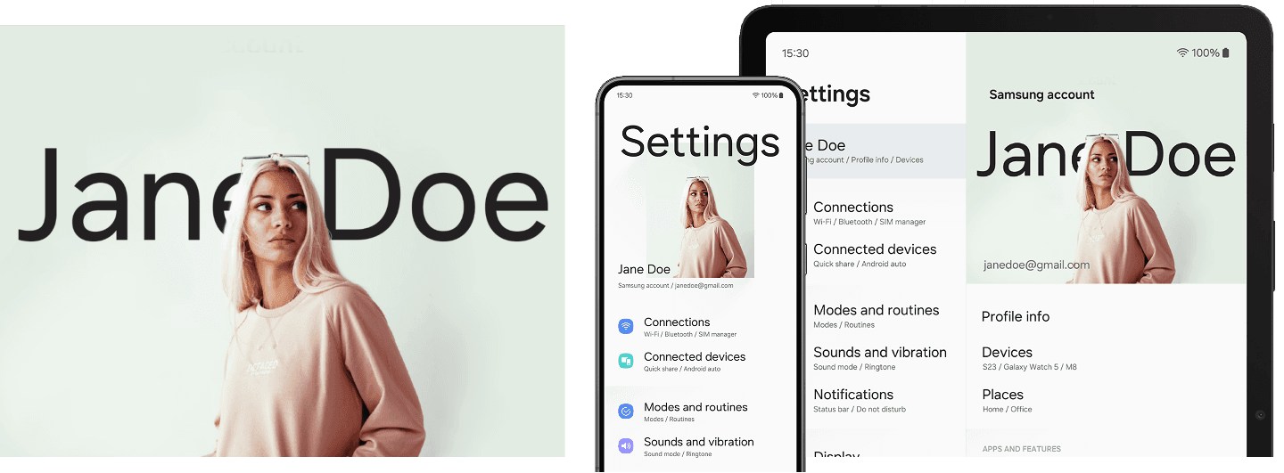

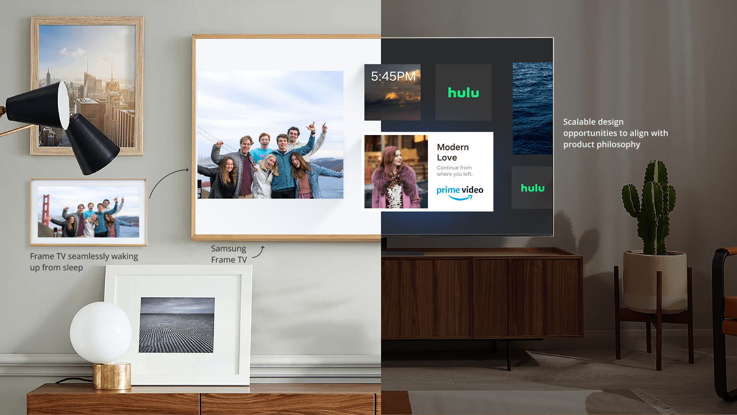
The vision was to build an OS that felt less like software and more like a personal universe, one that expanded across every screen and welcomed a new generation into Samsung's world.